The Portfolio of Justin Simoni
Currently Working On
Featured Work
Words (Kerouac)
The Portfolio of Justin Simoni
Words (Kerouac)
Psychoevolutionary Synthesis interpreted as Punk Rock Posters!
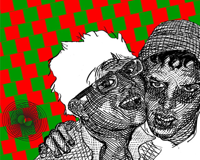
![]()
![]()
![]()
![]()
This small series of prints is based on the work of psychologist, Robert Plutchik, who wrote a book attempting to understand emotions, which seems like an intensely difficult thing to try to do. When I think, "Emotions", I also think, "Unpredictable", but perhaps it's because the people I know closely and also myself are a little more temperamental than most...
Nevertheless, Plutchik distilled the entire range of emotions to eight - four pairs of opposites: Joy/Sadness, Acceptance/Disgust, Fear/Anger and Surprise/Anticipation. He then arranged these emotions in a wheel - like a color wheel of the visible spectrum used by artists and then went so far as to say that if you mix these primary emotions, you can create every other emotion there is, out there - just like mixing colors on a painter's palette.
The work in this series is my interpretation on these general ideas and presents them in their complementary pairs. Dyadic relationships tend to cause conflict yet bizarrely share various similarities.
These pieces use portraiture, as humans describe their emotions using facial expressions, a color palette of complementary colors (mostly) - because colors communicate emotion and various famous optical illusions and patterns to attempt to strengthen the relationship of the entire composition and provide an abstract and sometimes illogical metaphor for the emotional pairings.
Drawings are used instead of photography, since drawing is personal, subjective and drawings in this kind of style are an attempt to create dimensional space on a flat piece of paper - another illusion - they’re just black marks on a white ground.
The style of these prints is informed by posters and advertisements for music shows and events. I love how rock posters look - usually made to catch your eye and communicate a simple idea: Come and Listen, using non-sequitur imagery, sex, pop references... loud things.
There's no text in these prints and the way I weave the ideas are far from straight-forward. The prints themselves are meant to look good and catch your eye, just like a poster in a noisy street corner, but they also have depth to them, which will take a little while for a viewer to unravel. These are by no means illustrations of Plutchik's ideas - as I am no means a proficient illustrator. It is my personal interpretation, tempered by my own fragile and hard-to-define emotions and whims that, like your own emotions, I'm pretty sure Putchik would have a hard time pinning down exactly.
Three-Color Screenprint 16" x 20"
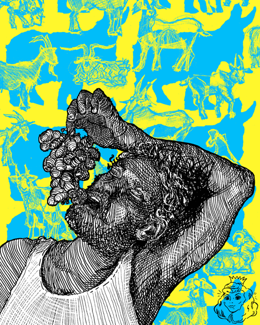
Joy/Sadness pivots around a Dionysusian character, symbolized by the eating of grapes and background of goats. I thought it a little too direct to add some sort of wine glass or even a wreath of grape leaves, opting to simply show a expression of being on the verge of complete and utter inebriation, while still attempting to enjoy the good things in life.
Within the background of goats is a sillouette of asses - another symbol that attempts to be the antithesis for the goats that seem to create a negative, wherever the asses are and aren't at the same time.
The small optical illusion in the lower right is a princess which, if seen upside-down, turns into an old hag.
Three-Color Screenprint 16" x 20"
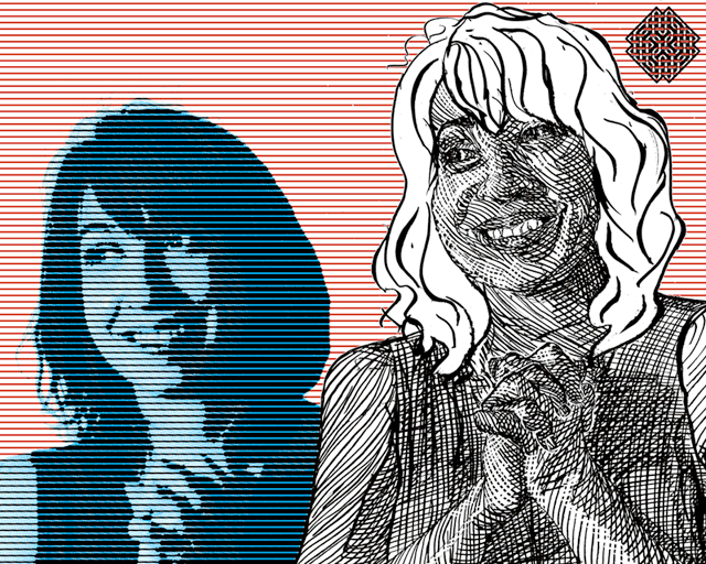
Suprise/Anticipation has a double image of the same figure - one done in pen and ink originally and the other a halftone overlaid with a different halftone-like effect (which, if named, I haven't found exactly what that name is!). The dialogue between the figures is open for interpretation, but perhaps the drawing is meant to bring out the facial expressions of the source image better than the more mechanical reproduction of the same source image.
The optical illusion is somewhat subtle - the lines that run across the face of the bottom left figure are in fact straight and not at a slight diagonal up.
The Infinite Celtic Knot, interwoven into the red background at the top perhaps hints at the relationship between the two figures as being woven into each other.
Four-Color Screenprint 16" x 20"
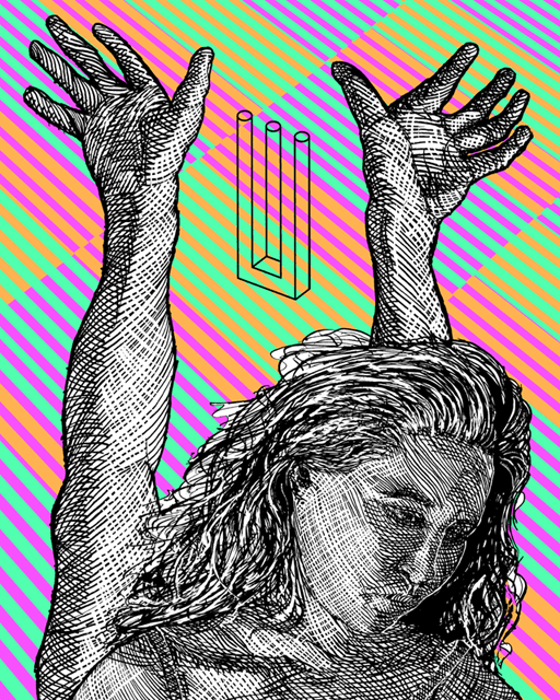
Acceptance/Disgust centers around an impossible figure of the woman looking down in defeat, while also raising her hands in Orant (surrending to the powers that be). If you take a closer look, you'll notice that the woman's shoulders and arms are down and that the arms that you can see aren't actually her's - the lighting is coming from the opposite direction and they're actually a male's arms, but they still would occupy the same space, if, somehow, this scene was possible.
This is echoed in the optical illusion of the Impossible Fork - two disparate images that blend together perfectly, but cannot at the same time, be there.
The background is another famous optical illusion of color shifting, hinting that things are not quite as they seem (there are only 3 different colors in the background - not four)
Three-Color Screenprint 16" x 20"
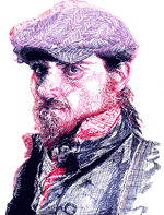
My personal idea on Fear/Anger is that these two emotions - more so than any other are more similar as complements than any other and perhaps even confusing to even communicate. I'll leave it up to you to wonder which figure is meant to be, "Fear" and which is meant as, "Anger".
Thus, I chose to show a couple in a sort of embrace - both having similarities, yet both performing different roles within the relationship. The background is of the famous, Café Wall illusion pattern, where the parallel lines attempt to go top diagonals against themselves. The color scheme fights for your attention - as perhaps each figure may.
The relationship between these two emotions is then simplified in the classic Moiré pattern optical illusion.